Representing Data
There are a number of ways of representing data diagrammatically.
Scatter Graphs
These are used to compare two sets of data. One set of data is put on the x-axis (the horizontal axis) and the other on the y-axis (the vertical axis). If one set of data depends upon the other, this is put on the y-axis (and is known as the 'dependent variable'). For example, if you were plotting a child's height at various times, the height would depend upon the time and so the height is the dependent variable and goes on the y-axis, whereas time doesn't depend on anything and so is the independent variable and goes on the x-axis.
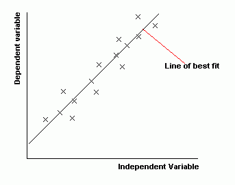
Usually, we are looking to see if there is a relationship between the two sets of data. We draw a line of best fit. This should have roughly the same number of points above and below it.
The less scatter there is about the best-fit line, the stronger the relationship is between the two quantities. If the points are close to the best-fit line, we say that there is a strong correlation. If the points are loosely scattered, there is a weak correlation. We say there is zero correlation if there is no linear relationship between the variables- in other words if we can't draw a meaningful best fit line.
Also, if the best fit line slopes upwards, like it does below, then the things we are comparing go up together. We say that there is a positive correlation. If the line slopes down, the 'dependent variable' decreases as the 'independent variable' increases. We say there is a negative correlation.
Image
Stem and Leaf Diagrams
A stem and leaf diagram is a way of grouping your data into classes. The good thing about it is that from the diagram you can obtain the original data- so no information is lost.
Example
Suppose you have the heights of 20 people as follows:
154, 143, 148, 139, 143, 147, 153, 162, 136, 147, 144, 143, 139, 142, 143, 156, 151, 164, 157, 149, 146
First decide upon what you want the classes (groups) to be, choosing classes of equal width. We might, for example, choose our classes to have a width of 5 and have the following classes:
135 - 139
140 - 144
145 - 149
150 - 154
155 - 159
160 - 164
We can easily see which heights fall into which classes:
135 - 139: 139, 136, 139
140 - 144: 143, 143, 144, 143, 142, 143
145 - 149: 148, 147, 147, 149, 146
150 - 154: 154, 153, 151
155 - 159: 156, 157
160 - 164: 162, 164
What we have here is almost a stem and leaf diagram. Note that with the data written in this way you can see what the modal class is (the one with the most values- it is 140-144). You can also see the shape of the distribution- most of the values are in the 140s with higher or lower values rarer.
To change this into a proper stem and leaf diagram, we just simplify it a little. Instead of writing out the full figures each time (143, 143, 144, 143, ...) we write '14' and call this the 'stem' and then write 3, 3, 4, 3, ... (these being the 'leaves'). We would usually, however, write the leaves in order (with the smallest first). Finally, we must also include a little key so that people know how to interpret the diagram.
So we finish up with:
Image
Bar Chart
A bar chart is a chart where the height of bars represents the frequency. The data is 'discrete' (discontinuous- unlike histograms where the data is continuous). The bars should be separated by small gaps.
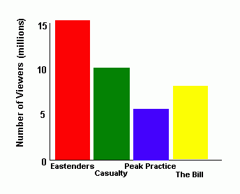
Image
Pie Chart
A pie chart is a circle which is divided into a number of parts.
Image
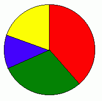
The pie chart above shows the TV viewing figures for the following TV programmes:
- Eastenders, 15 million
- Casualty, 10 million
- Peak Practice, 5 million
- The Bill, 8 million
Total number of viewers for the four programmes is 38 million. To work out the angle that 'Eastenders' will have in the pie chart, we divide 15 by 38 and multiply by 360 (degrees). This is 142 degrees. So 142 degrees of the circle represents Eastenders. Similarly, 95 degrees of the circle is Casualty, 47 degrees is Peak Practice and the remaining 76 degrees is The Bill.
Category