The Differences Between Line Graphs, Bar Charts, and Histograms
This section explains the differences between Line Graphs, Bar Charts, and Histograms. Graphs are an essential tool for representing numerical data in a clear and structured manner. They help identify patterns, compare values, and draw conclusions. Selecting the appropriate type of graph is crucial for accurately conveying information.
Line Graphs
Line graphs are used to show changes over time or space. They are particularly effective for illustrating trends and patterns.
Image
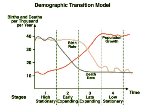
- The x-axis typically represents time or distance.
- The y-axis represents the variable being measured.
- A line connects data points to indicate changes over a period.
Example: A line graph could illustrate the changes in a country's employment structure over several decades, showing the proportion of people working in primary, secondary, tertiary, and quaternary industries.
Bar Charts
Bar charts display categorical or grouped data using rectangular bars of varying lengths. They are useful for comparing quantities across different groups.
Image
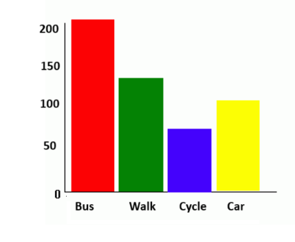
- Bars can be drawn vertically or horizontally.
- Each bar represents a single value.
- A divided bar chart segments a bar into different sections to represent subcategories.
Example: A bar chart could be used to display the number of tourists visiting a resort each month, while a divided bar chart could further break this down by age groups.
Population Pyramids
A population pyramid is a specific type of bar chart that represents the age and gender distribution of a population.
- The y-axis represents age groups.
- The x-axis represents the number of people.
- Bars are positioned sideways, with males on the left and females on the right.
Example: The UK's population pyramid may show the largest population group in the 30-39 age range, with a gradual decrease in numbers in older age groups.
Histograms
Histograms resemble bar charts but are used to display the frequency of data within continuous intervals.
- Unlike bar charts, the bars in histograms touch each other to indicate continuous data.
- The x-axis represents data intervals (e.g., earthquake magnitudes).
- The y-axis represents the frequency of occurrences within each interval.
Example: A histogram could illustrate the frequency of earthquakes of varying magnitudes on the Richter scale.
Other Types of Graphs Used in Geography
Pie Charts
Pie charts represent data as proportions of a whole.
Image
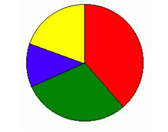
- A circle is divided into segments based on percentages.
- Each segment represents a proportion of 360°.
Example: A pie chart could show the percentage of students who travel to school using different modes of transport.
Scatter Graphs
Scatter graphs display relationships between two variables.
Image
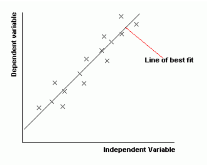
- Points are plotted based on x and y values.
- A line of best fit helps visualise trends.
Correlation Types:
- Positive correlation: As one variable increases, so does the other.
- Negative correlation: As one variable increases, the other decreases.
- No correlation: No clear pattern exists.
Example: A scatter graph could show the relationship between a country’s GDP and life expectancy.
Proportional Symbols and Pictograms
Proportional symbols represent quantities using differently sized shapes.
- Used to compare variables such as population size across different countries.
Pictograms use icons instead of bars to display data.
- Each symbol represents a set quantity.
Example: A weather pictogram may use a sun icon to indicate the number of sunny days in a month.
Cross Sections
Cross sections provide a side view of a landscape.
- They illustrate height and depth features, such as valleys and hills.
- Negative values represent depths below a reference point (e.g., riverbed depth).
Example: A cross-section diagram could depict a river profile, showing changes in depth across its width.
Radial/Radar Graphs
Also known as rose charts, these graphs have data radiating from a central point.
- Often used to display wind speed and direction.
Mapping Techniques in Geography
Choropleth Maps
Choropleth maps use shades of a single colour to represent data.
- Darker shades indicate higher values.
- A key is necessary to interpret the data.
Example: A choropleth map can illustrate population density variations across a country.
Isoline Maps
Isoline maps use lines to connect areas of equal value.
- Used for continuous data such as temperature or atmospheric pressure.
Example: A weather map showing areas of equal pressure with isobars.
Dot Maps
Dot maps represent quantities using dots.
- Each dot may represent multiple occurrences.
Example: A dot map could show population distribution in a country, with each dot representing 100,000 people.
Desire Lines and Flow Lines
Used to depict movement patterns between locations.
- Flow lines show exact paths.
- Desire lines indicate the general direction of movement.
- Thicker lines represent higher volumes of movement.
Example: A flow line map could illustrate migration patterns between countries.
Proportional Symbol Maps
Proportional symbols on maps vary in size according to the quantity they represent.
Example: A proportional symbol map could show the distribution of wind farms across a country, with larger symbols indicating greater numbers.
By understanding and selecting the appropriate graph or map type, geographers can effectively communicate and interpret data, aiding in analysis and decision-making.
Category